Showing posts with label kraft. Show all posts

Sunday, 15 September 2013

Farewell to Summer

Well, we're midway through September now and I think it's fair to say that summer is officially over. I hope you had a good one. And I hope Autumn isn't going to be too wet, cold and windy for you.
Unlike the image I've used for my card for the new "Autumn/Fall" challenge at One Stitch at a Time:
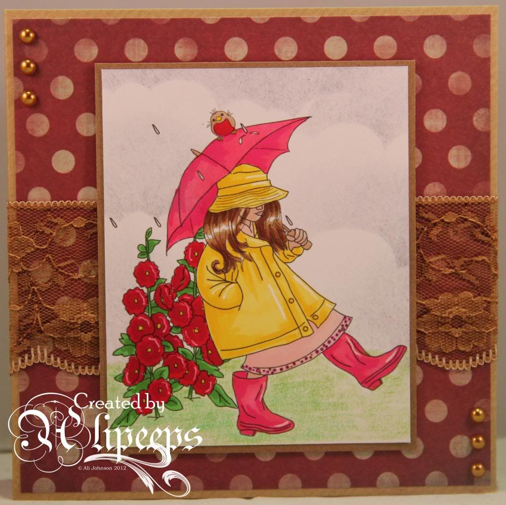
I used this sweet "Stroll in the Rain" digi stamp by Reese's Scrap Pieces and coloured it with a mixture of Promarkers and Prismacolor pencils. And I had a go at creating a cloudy sky background using Distress Inks... I think the Weathered Wood Distress Ink was the perfect colour for a gloomy, rainy sky, eh? :)
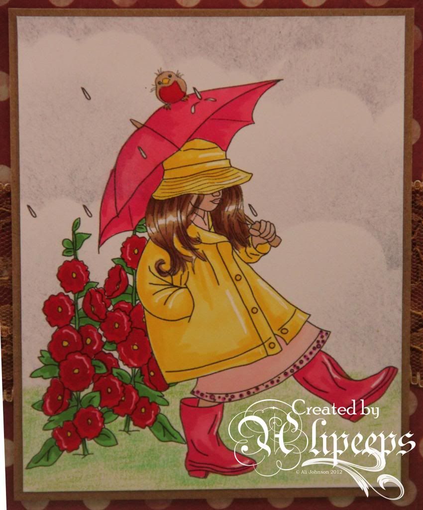
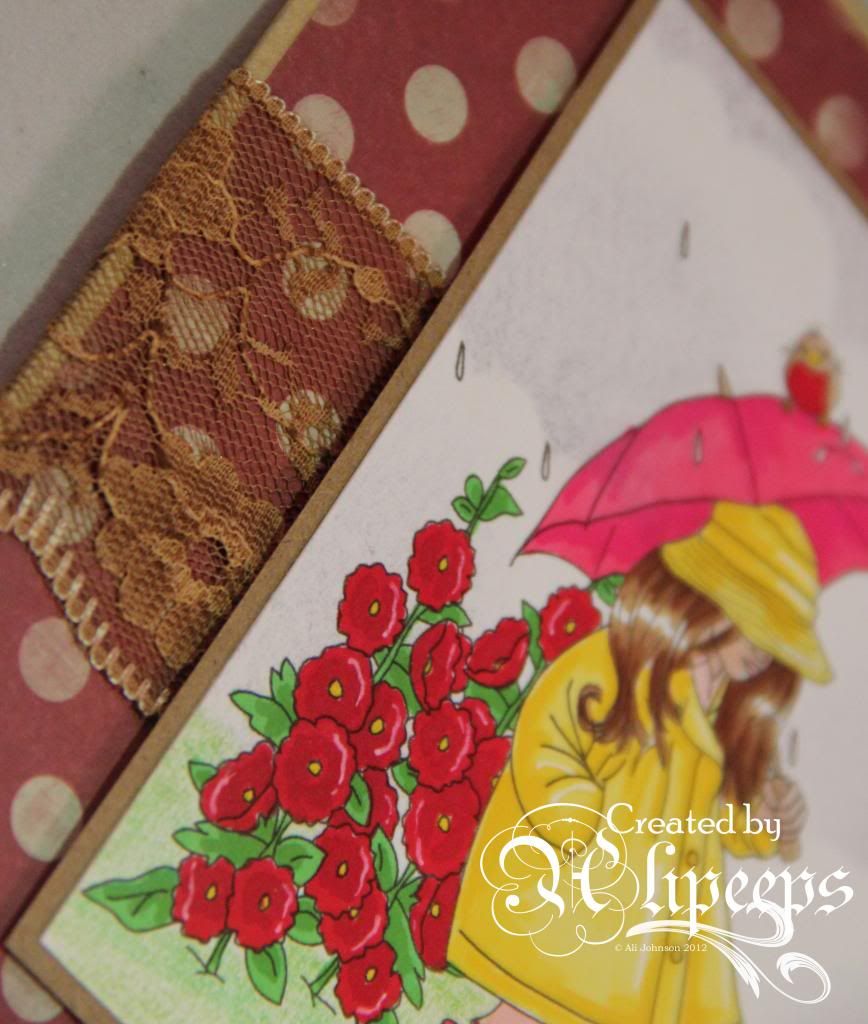
I used kraft cardstock and patterned paper in rich, autumnal colours and added a piece of gorgeous brown lace and finished things off with some pearls in a bronzy brown colour.
To enter the challenge, just make a project that fits our theme and link it up at the OSAAT blog. If you use a Stitchy Bear product (and we'd love to see your Stitchy Bear creations! :D) you'll be in with a chance to win our main prize. Entries without a Stitchy Bear product will be entered into the draw to win a $3 gift voucher to the Stitchy Bear Digi Outlet.

I'm entering this card into the following challenges:
613 Avenue Create - Anything Goes (Happy Fall Y'All)
Challenges 4 Everybody - Anything Goes
Crafting When We Can - Seasons
Creative Inspirations Paint - Autumn Colours
Eclectic Ellapu - Inspired by a Song (Raindrops Keep Falling on My Head! :D)
Great Impressions - Fall Colors
Hobbycutz - Autumnal
Colour Me Creative Challenge - Anything Goes
Di's Digi Designs- Fabulous Fall Colours
My Time to Craft - Autumnal Colours

Friday, 13 September 2013

Time to Kraft

Today's new challenge at Sweet Pea Stampers is to use Kraft (card or paper) on your creation. I've gone for a rather steampunk-y feel for my creation, using Marlon Teunissen's Steampunk Angel digi stamp:
 
 
I coloured this gorgeous image in rich colours of red and gold and green, using my Promarkers:
 
 
I decided my Prima Chronology embossing folder and coordinating papers would be just perfect with this stamp so I used a kraft card blank and ran kraft card through the embossing folder. I used a touch of Inka Gold around the edges of the paper and to highlight the embossing on the kraft card.
 
 
I cut out my coloured image and attached it on foam pads over the embossed panel and finished things off with a row of gemstones and some layered flowers topped with a clock charm.

 
You don't need to use a Sweet Pea Stamps product to enter the challenge but of course we would *love* to see your Sweet Pea Stamps creations. Entries with a Sweet Pea Stamps image will be eligible for our Designer's Choice award, as voted for by the Design Team, and will have an extra chance to win in our randomly selected prize draw. :)

Sunday, 19 May 2013

Getting Krafty

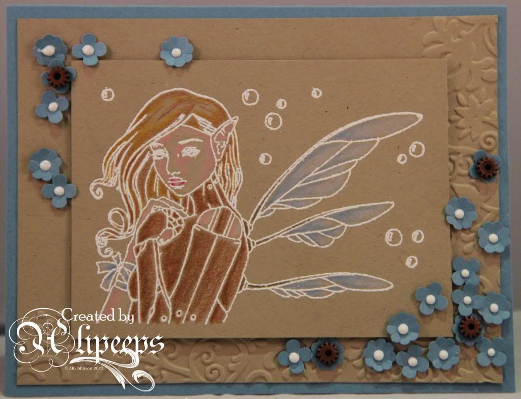
I've been seeing quite a lot of white embossing on coloured card in the online crafty-verse lately and it's a technique I was keen to try. I made this card (itself based off a card I found on Pinterest) and loved the effect and had the idea that white embossing might look lovely on a kraft-coloured card, with perhaps some delicate colouring of the image.
 
So that's exactly what I did:
 
 
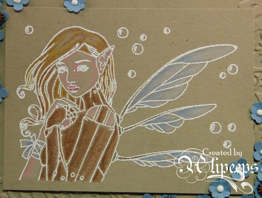
I thought this striking Repose image by Brigid Ashwood would be perfect for this technique and I love how she looks embossed and coloured this way.
 
 
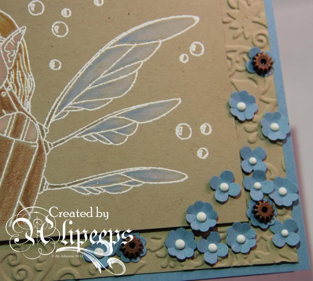
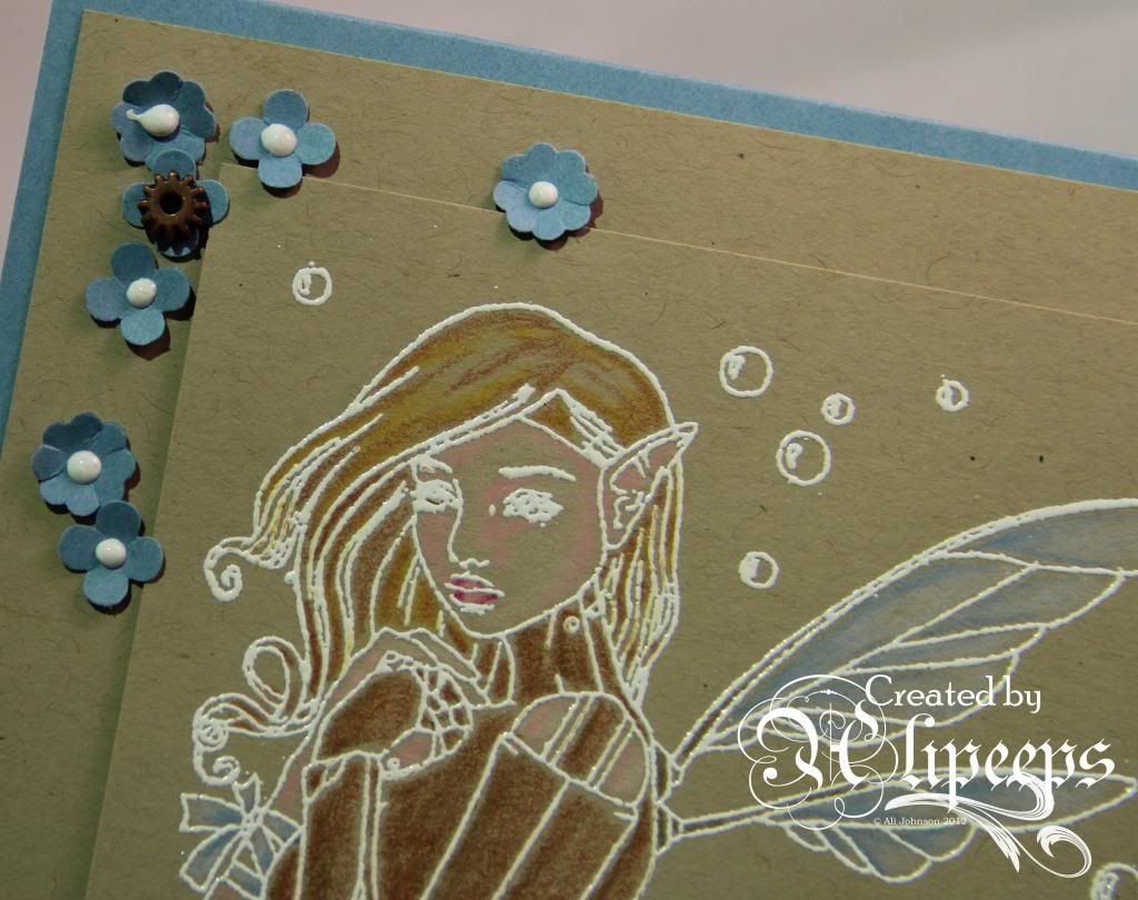
I stamped her using Versamark ink and heat embossed with white embossing powder and then added some delicate colouring using Prismacolor pencils. I kept things fairly simple with my card (I seem to be on a bit of a simple, unfussy kick at the moment), deciding the image would look best layered against cardstock of the same colour - I dry embossed this piece of card with an embossing folder and then layered that onto a card blank made from blue card.
 
 
I finished things off with some small flowers punched from blue card, decorating the centres with Enamel Accents and tiny metal cogs. I think the overall effect, with the contrast of the kraft and blue and the bright white of the embossing, is quite striking. :)
 
 
You can buy this stamp in red rubber format from the Sweet Pea Stamps store.
 

Wednesday, 15 May 2013

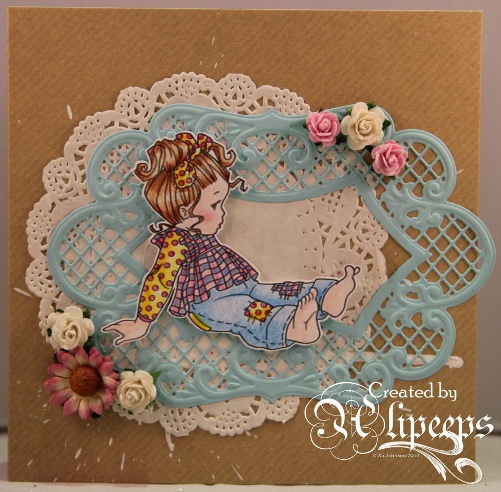
Shabby Chic Little Curls

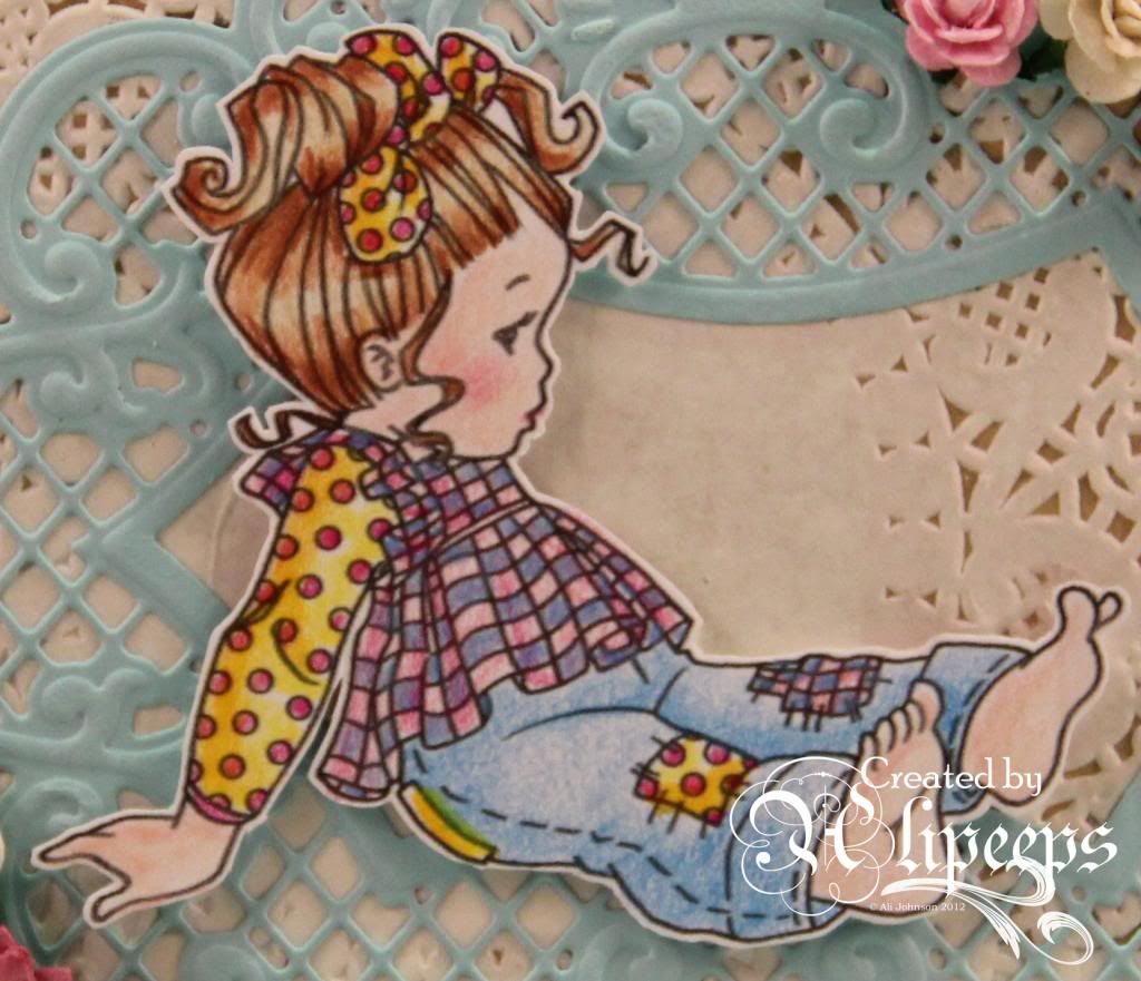
It's Variations Week again at Sweet Pea Stamps and all the Design Team are creating projects with the same image - this time around is this adorable Little Curls stamp by Elisabeth Bell.
 
 
I loved colouring this image. It's so sweet and it's looks just lovely when coloured in. I used my Prismacolor pencils to colour it - I'm enjoying these pencils more and more and feel like I'm starting to get the hang of them. They give such a soft, pretty effect when colouring an image like this.
 
 
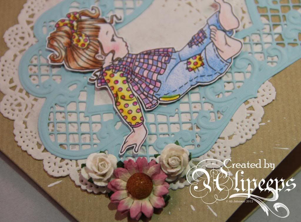
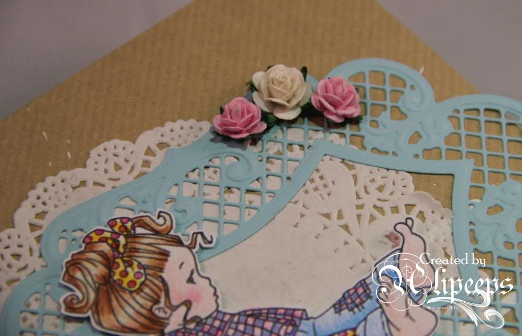
I went for a kind of shabby chic vibe with this card. I started with a kraft card blank and ended up keeping things quite simple as I felt it worked really well with the image. I splatted some white Distress Stains onto the card front and let it dribble across the card before drying it. I then added a pretty white doily and layered a delicate die-cut frame over it.
 
 
I fussy-cut out the image and attached it with foam tape over the die-cut frame and finished things off with some pretty flowers.
 
 
This was a really quite quick and simple card but I think it's quite effective. You can buy this image in red rubber format from the Sweet Pea Stamps store.
 
Related Posts Plugin for WordPress, Blogger...