Showing posts with label simon says stamp and show. Show all posts

Saturday, 8 September 2012

Happy Birthday Marie-Ann

My niece turns 21 this month. Unfortunately we can't make it to the "do" as small children and evening events over 2 hours drive away are not a good combination. So we're heading down to the wilds of Lincolnshire this afternoon to say hello and drop off a card and gift.
 
And this is the card I've made for her:
 
 
This pretty image is an A Day for Daisies digi stamp and I coloured her with Promarkers and inked the edges with Distress Inks. I used an old book page (from The Iliad, if anyone's interested! :D) for the background and coloured it with Distress Inks and Perfect Pearls (it has a lovely shimmer in real life). I used Tim Holtz Idea-ology numbers, coloured with alcohol ink, and added a die cut flourish (from a Memory Box die) and some flowers and a stamped greeting to finish.
 
I think this came out really bright and pretty but without being too little girly. I hope. :)
 
I'm entering this card into a couple of challenges:

Sunday, 12 August 2012

Paint and glitter

Is there anything more fun? :)

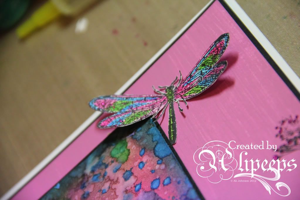
I wanted to have a play with paint because of the fun "Paint It Up" challenge at Simon Says Stamp and Show this week. But I also desperately wanted to have a play with my new summer colours Distress Inks... ever since I saw them used in this project by Sarah Engels-Greer, I just *loved* the colours and decided I had to have them! And they arrived this week. :)

So this is what I made:


Aren't the colours just lush?

I cut a piece of card and used Tim Holtz's Wrinkle Free Distress Technique (from the fab Chemistry 101 online class I did earlier this year) to make the background and then stamped some abstract foliage around the bottom using Jo Capper-Sandon's Splatter Long stamp from Stampotique and then stamped and embossed the sentiment (another Stampotique stamp).

I also used the Distess Inks to paint in the stamped dragonfly and added a layer of magenta Stickles over the top before cutting it out.

I added paint into the mix by dabbing little "flowers" of Paper Artsy Fresco paint across the foliage, adding dots of more Stickles on top.

I used the same paint to paint a larger piece of card and then stamped the edges using a Tim Holtz foilage stamp, and added some more Stickles. Both pieces of card were then matted onto black card.

To finish off, I added a piece of ribbon, mounted the whole piece onto a card blank and added a couple of metal pen nibs which I'd painted with Vintaj Patinas (curse you, Craft Stamper magazine, you keep making me buy new stash! :lol:). Et voila!

I'm entering this card into the following challenges:

Wednesday, 1 August 2012

Happy Birthday, Paul!

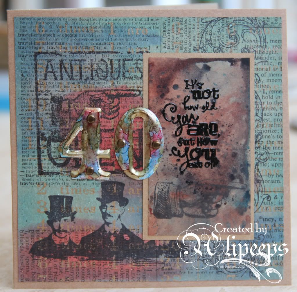
Tomorrow, my brother-in-law hits the big 4-0!

He's coming up for a visit at the weekend but in the meantime I thought I'd send him a card to arrive on the big day.

So I made him this:


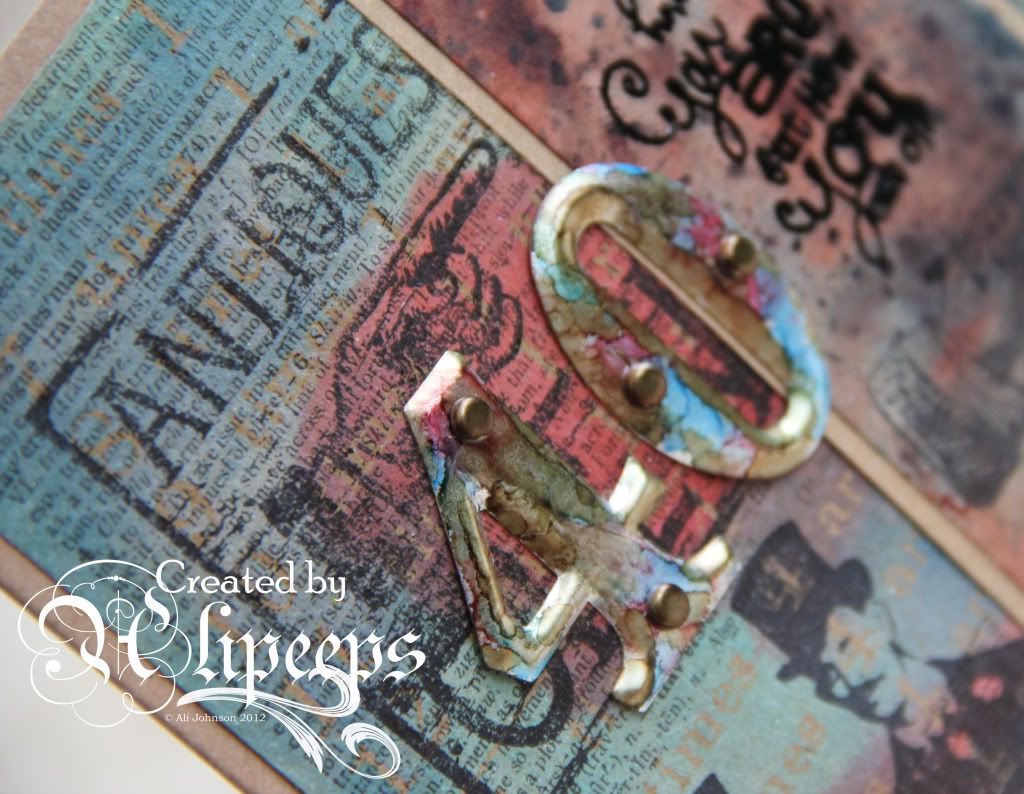
I went all Tim Holtz/grungy/steampunky with kraft resist cardstock, Distress Stains, steampunk/vintage stamps and metal numbers coloured with alcohol inks.

I hope BIL will appreciate the subtle placement of elements that leaves the word "Antiques" from one of the background stamps nicely visible on the card. ;)

I'm entering this card into the "What Do You Say?" challenge at Simon Says Stamp and Show.

Monday, 2 April 2012

Tags, tags and more tags!

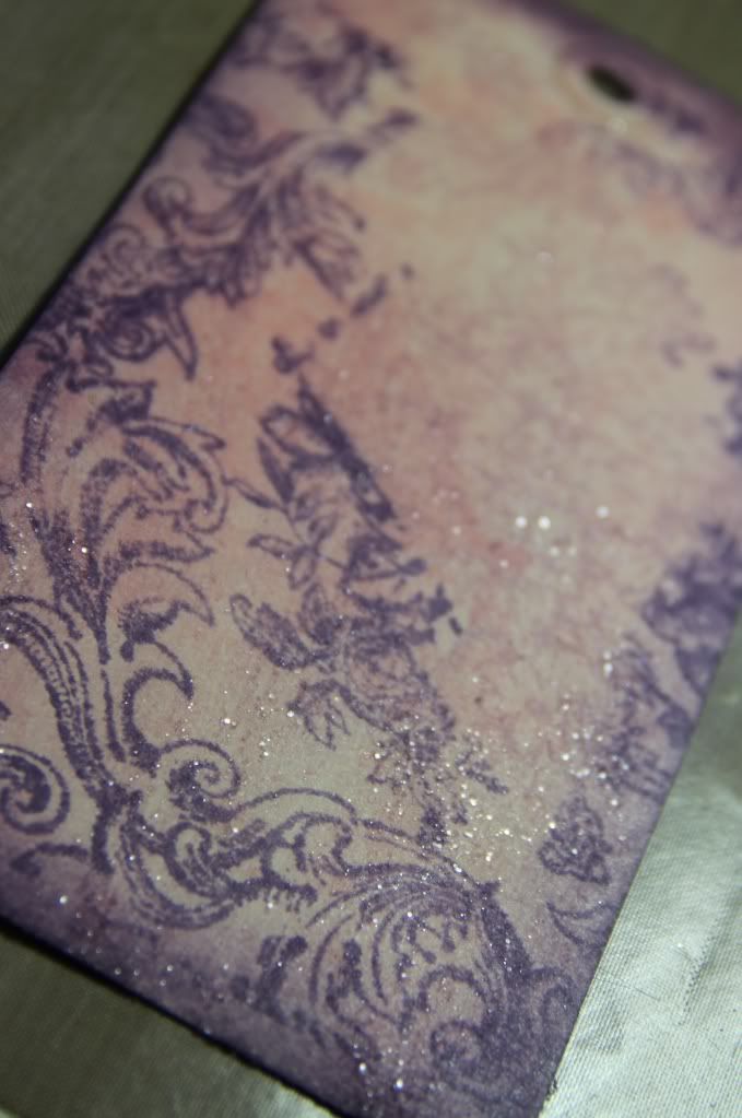
I've finally found time to take, upload and sort photos of my tags for week 2 of Sir Tim of Holtz's Creative Chemistry 101 class. I've missed Day 6 completely, sadly, because I don't have any Distress Markers yet.. I *should* have had some this week but, with fabulous timing, QVC decided there was going to be a week's delay in shipping them. Grrrr. But I've done my tags for days 7-10. :)


Angled photo to try and show the shimmery sheen

I really enjoyed this class. So many fab ideas and techniques and even though I'd used some of the techniques before, seeing Tim demo them "live" on a video made it all make sense so much more. I'm thrilled to bits with my collection of "reference" tags.

I've also already put some of the techniques to use to make a tag for this week's challenge at Simon Says Stamp and Show, where the challenge theme is... tags! Coincidence? I think not! ;)

So here's my tag:


I combined a couple of the techniques from this week's classes on this tag - the background is made using the Perfect Splatter Distress Technique from Day 9 and I stamped over it using black Archival. I die-cut the bird and cage from grungeboard and used first gold embossing powder and then an uneven smattering of Vintage Photo Distress Embossing Powder on the cage and used Tim's fabulous Shattered Stains Technique from Day 8 for a brightly-coloured, glossy bird. :)


Sunday, 25 March 2012

Bedazzling Black and White

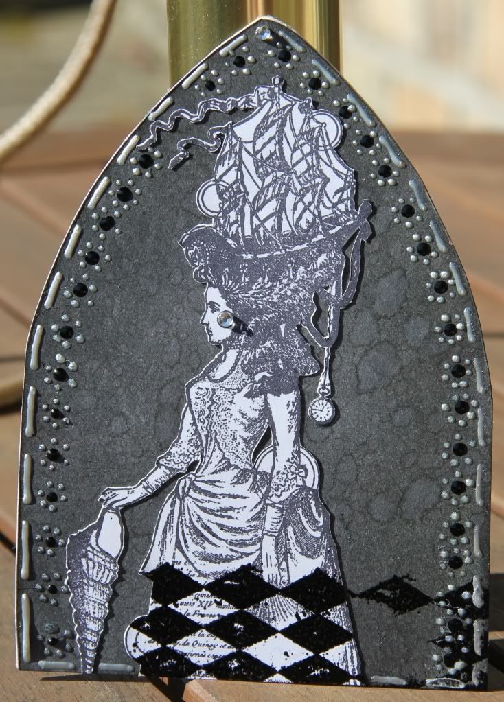
I was really pleased to see the Gothic Arch challenge blog up and running again cos I'd just gotten into making them when it went on hiatus. That said, I've not found time to take part in the first few challenges since it started up again but this week I have finally managed to do so. The theme for the current challenge is Bedazzled:

Lovely sunny photo for once - hasn't the weather been *gorgeous* today?! :)

I did a lot of decoration on this using Pearl Pens, in silver and pearl, and Enamel Accents, in black, and added a couple of diamante gems for a bit of "bedazzle". :)

I'm also entering this arch into this week's challenge at Simon Says Stamp and Show, where the theme is Handmade Backgrounds. Of course, given that I'm doing Tim's Creative Chemistry 101 course atm, I had about a gazillion ideas for making backgrounds but I really wanted to use this Lynne Perella stamp from Paper Artsy (a recent acquisition) and I just felt like it needed to be in black and white. And I'd also recently picked up a Black Soot Distress Inkpad so I decided to have a play with that and made a monochrome back background using Tim's "spritz and flick" technique. I'll be honest... the resulting effect wasn't quite what I expected... the wicking effect is not as visible/obvious on plain black but it makes quite a nice, subtle effect and I do like it.

I hope to find time to do more of the gothic art challenges. :)

Friday, 16 March 2012

Steampunk

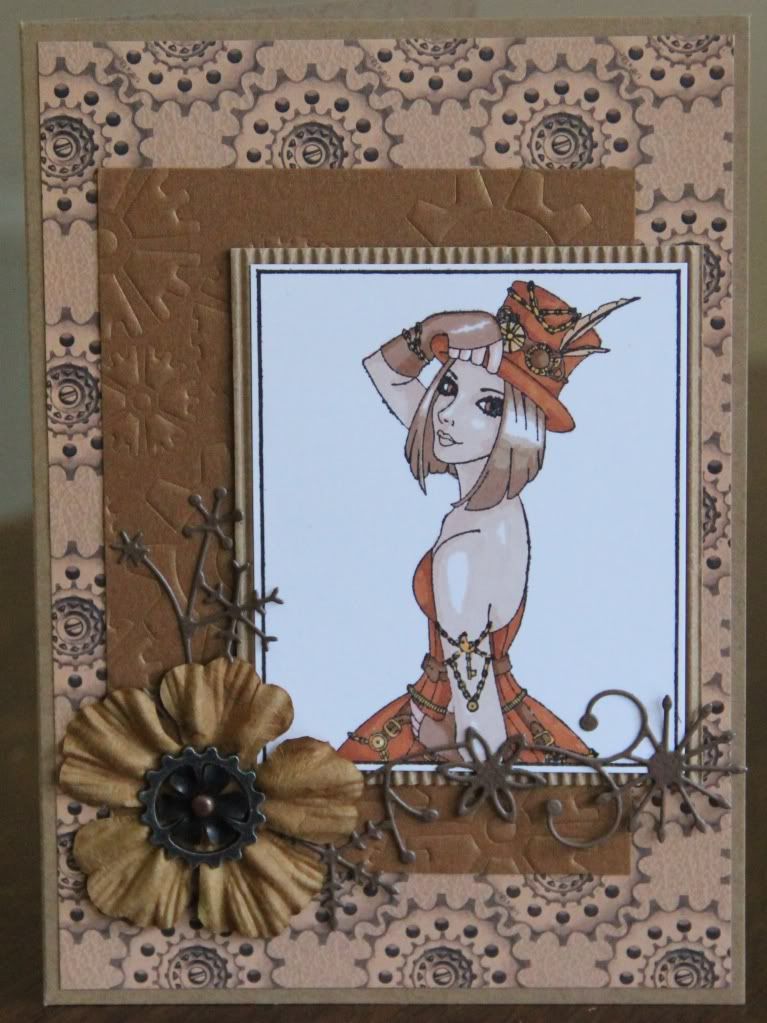
I've had this gorgeous, Steampunk-themed stamp from Sweet Pea Stamps for ages and never quite gotten around to using it... however the current challenge at Sweet Pea Stampers is "vintage" and it seemed the perfect opportunity! :)

It was also a good opportunity to do the "monochrome" challenge at One Sweet Challenge. I coloured the image with my Promarkers and matted it onto corrugated card. I ran bronze coloured card through my BigShot with a cogs stencil and used papers from a steampunk paper pad by Kanban on a kraft card blank. Oh and I tried out my new Memory Box die for the first time and added a flower and some TH Idea-ology bits to finish.

I'm also gonna go mad and enter this card for the current "Anything Goes" challenge at Simon Says Stamp and Show. :)

Sunday, 26 February 2012

Serendipity

That's the word for it.

The fortunate and perfect concurrence of this thread over at UKS and this week's "London, Paris or New York" theme at the Simon Says Stamp and Show challenge blog.

I just HAD to have a play with my new City in a Box items from Muji for this challenge... and I could have done any of the three cities in question, as I had a City in a Box for each of them! :)

But my immediate instinct, as soon as I even laid eyes on these cute little models, was to have a play with the iconic Eiffel Tower. And so I did. :)

From this:


To this: :)


I cut sections of Basic Grey Alyssa patterned paper to fit each side of the tower and then inked the edges with Tea Dye Distress Ink. I used the same ink to stamp each piece with the text stamp from Tim Holtz's Papillon stamp set and also stamped some butterflies from the same stamp set onto the Basic Grey paper. I cut the butterflies out and gave them a coat of Rock Candy Distress Crackle Paint.

I glued the stamped papers onto the tower and added the butterflies. I made a little pennant by stamping Amour (from a Stampin' Up! stamp set) onto more of the same paper and inking the edges I wrapped it around a piece of bronzey-coloured wire, finishing it off with a heart-shaped bead and crimp beads. I hot glued it to the top of the tower along with a TH Idea-ology flower. Et voila! Le Tour Eiffel, gone vintage and shabby-chic. :)

Sunday, 19 February 2012

Butterfly Tag

Will the current crafting trend for butterflies ever end? I hope not, cos I love it. I have so many butterfly stamps and just about any project looks good with a butterfly or two added! :lol:

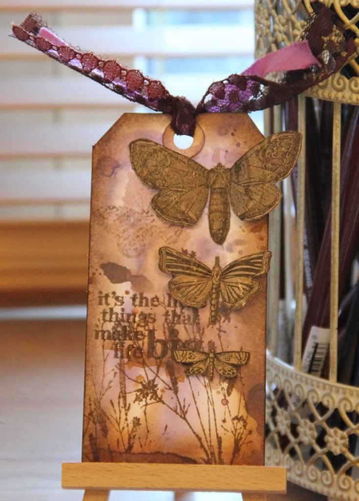
I played on a recent card with cutting out some butterflies from a sheet of patterned paper from my Tim Holtz kraft stack and I liked the look so much I decided to make a tag using more butterflies cut from this paper:


I also got chance on this project to have a play with the distress stain background technique from this month's Craft Stamper magazine - I've been dying to have a go since the mag came out but I had to get my mitts on some Picket Fence Distress Stain first! :)

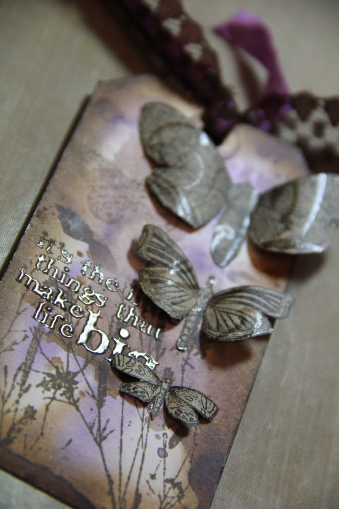
So the background was made as per in the mag, using Picket Fence, Dusty Conchord and Walnut Stain distress stains and then edged the tag with Walnut Stain distress ink and stamped ferns and the wording with Walnut Stain distress ink, adding clear embossing powder to the wording. I curled the wings of my cut-out butterflies and stuck them on using Glossy Accents on the body only. And I added brown lace and lilac seam binding ribbon to finish.

I'm entering this tag into the "Anything Goes" challenge at the Simon Says Stamp and Show blog. :)

Sunday, 5 February 2012

ATC experiments

I've been making a few ATCs lately, using a variety of techniques. I love playing with ATCs... they're the perfect-sized canvas to work on, a nice size, not too big, meaning they can be completed fairly quickly and are great for playing with new ideas and techniques.

The first set I made used fairly simple inking and stamping techniques and started out from me wanting to have a play with the Distress Stain watercolour stamping technique featured in the March issue of Craft Stamper magazine:


I also used my Flexmarkers on this to colour in the stamped butterfly image.

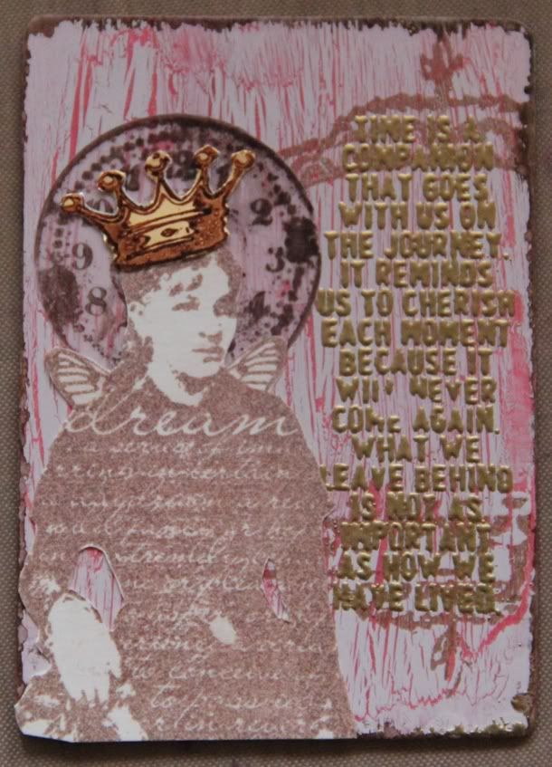
The second set I made was a much more collaged affair. I used acrylic paints and PVA glue to make the crackled background and then stamped over the background and inked the edges and collaged images stamped variously onto cardstock, vellum and matt gold cardstock to make the final image.


I'm entering this ATC into this week's "Kings and Queens" challenge over at Simon Says Stamp and Show.

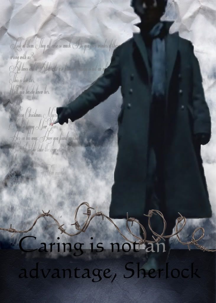
And finally, I had a play with making digital ATCs. And yes, I'm still on that Sherlock kick. ;) I used a screencap from the show and used PSE 10 to collage it together with elements from the Inner Storm digikit (from Creative Victorian) and some text.


The first two sets of ATCs are pretty much accounted for in various swaps but I'm printing a limited run of the digi ATCs and will have a couple for swapping if anyone's interested?

Monday, 30 January 2012

Jar of Hearts

Here's a fun little project. This was inspired by (and is being entered for) two separate challenges... the UKS Technique Thursday challenge (I wanted to try the crackled/shattered glass technique) and the Simon Says Stamp and Show Challenge, which is to stamp and show a song title (what a fab idea)!

The song that immediately sprung to mind when I thought of favourite songs, is Christina Perri's Jar of Hearts. DH and I *love* this song - so much so that I bought him the album for christmas.

So the idea occured to me to make an actual jar of hearts! :)


I had some of these cute little mason jars lying around that I found in a pound shop and thought might be fun to alter.

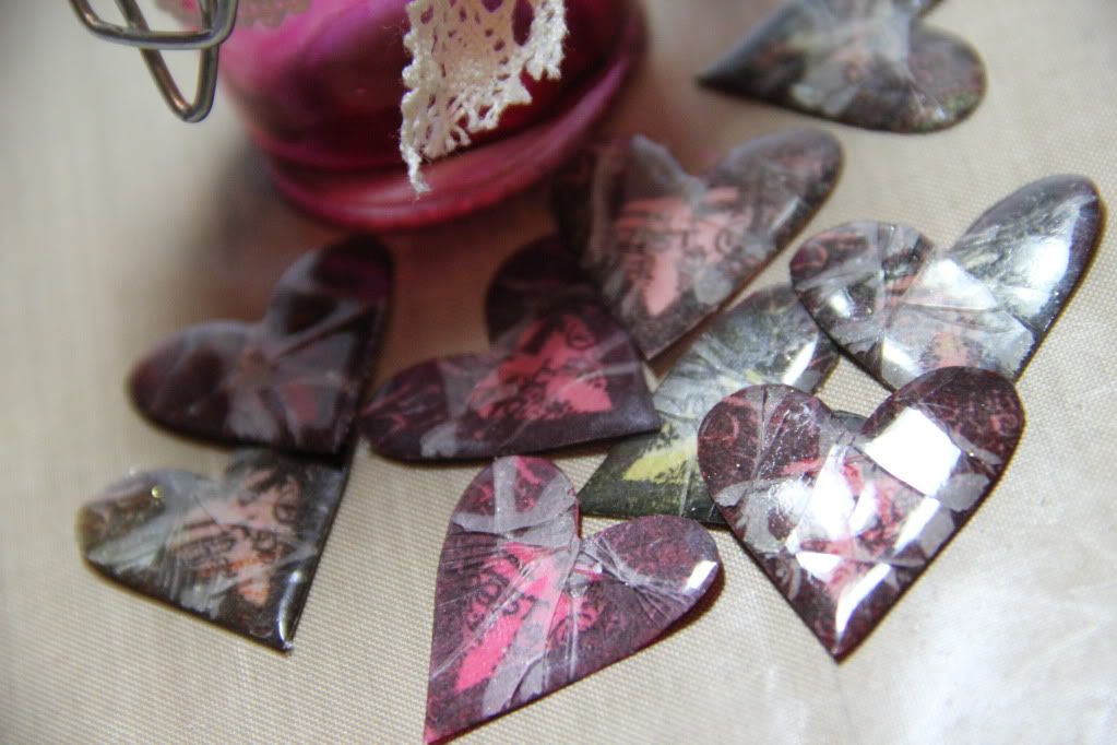
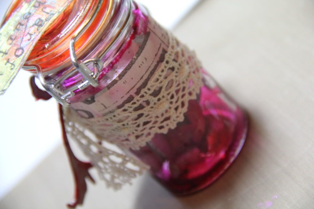
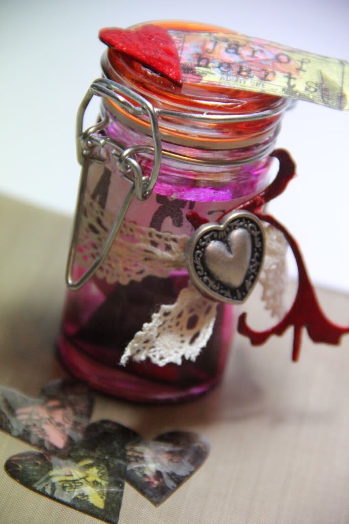
I used some alcohol inks to colour the inside of the jar and I made a little collection of hearts by stamping a Crafty Individuals heart image onto various scraps of pink/red coloured paper, cut them out, and then used the crackled glass technique (several layers of UTEE and then placed in the freezer to cool before being bent and twisted to make the UTEE crack). I thought the cracked hearts fit very well with the lyrics of the song.


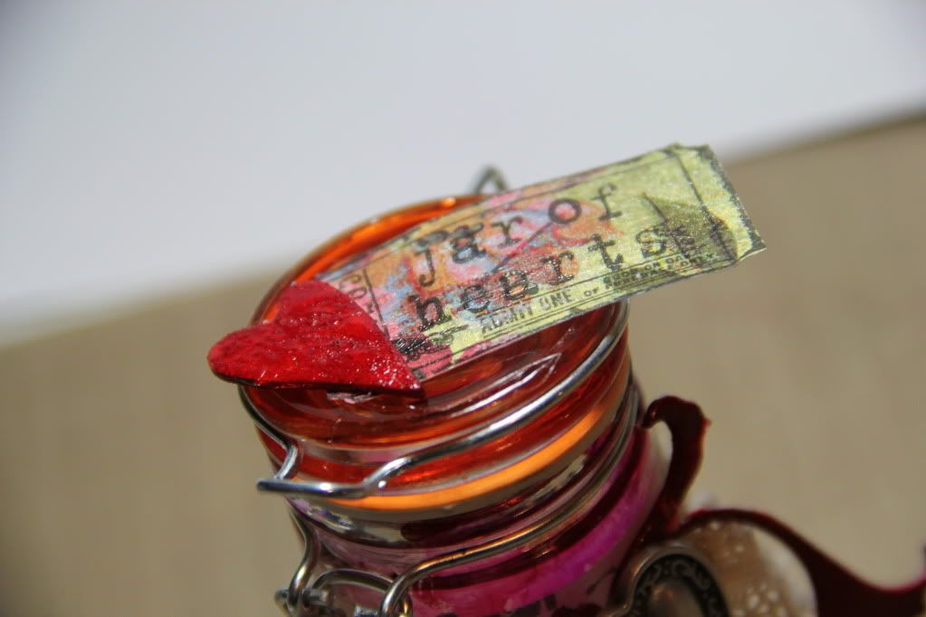
To finish decorating the jar I wrapped some TH tape around it along with a piece of lace ribbon and a vintage metal button. I coloured a TH grungeboard flourish and heart with red Distress Ink and stamped a TH ticket onto patterned paper and stamped the title onto it and then added a layer of Rock Candy Distress Crackle Paint to all three. I glued the ticket and heart onto the lid of the jar and the flourish around the ribbon/button.


Et voila. A jar of (broken) hearts.


Sunday, 18 September 2011

Steampunk Birthday Card

It's my friend's birthday tomorrow so I made a card to pop in the post to her (cos she moved to Scotland last year! *sob*). I decided to combine the need for a birthday card with the current challenge over at Simon Says Stamp and Show, as the theme is Steampunk... which is a) a cool theme and b) the perfect opportunity to try out the new Kanban steampunk stamps and papers that I got recently off C&C. :)

So here's my steampunk creation:


I made an easel card and covered the front faces with cog patterned paper (I also cut down the top section of the easel card so its smaller than usual, so that the stamped image would extend over the top of it). I trimmed sections of white card for each section and used Tea Dye Distress Ink blended around the edges and then stamped around the edges with the cogs stamp using Tea Dye again. I stamped the dressform image onto white card using Archival Ink and painted it in with Distress Inks before cutting it out. I stamped the dressform stand onto the decorated card base and attached the dressform with foam pads. To finish off I added some Kaisercraft wooden swirls, coloured with Distress Inks, and some layered flowers and stamped a greeting in Tea Dye Distress Ink.

I'm really pleased with how this came out. It looks really pretty and kind of vintagey but a bit industrial-ish at the same time. :) Hope my friend will like it.

Sunday, 21 August 2011

Blingy enough for ya?

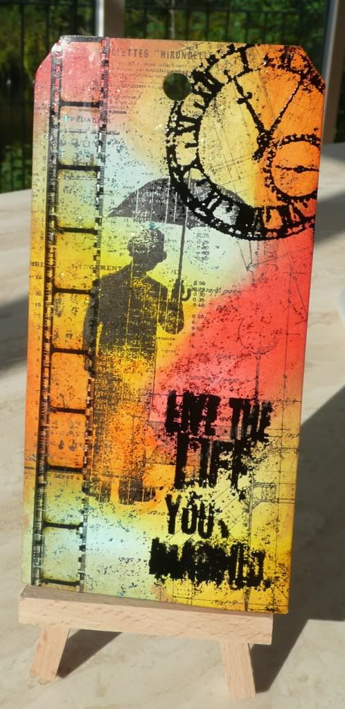
This week's challenge theme at Simon Says Stamp and Show is Bling! And seeing as I'd just recently invested in some new colours of Stickles, it seemed like a match made in heaven...

This photo doesn't really capture the "bling"...
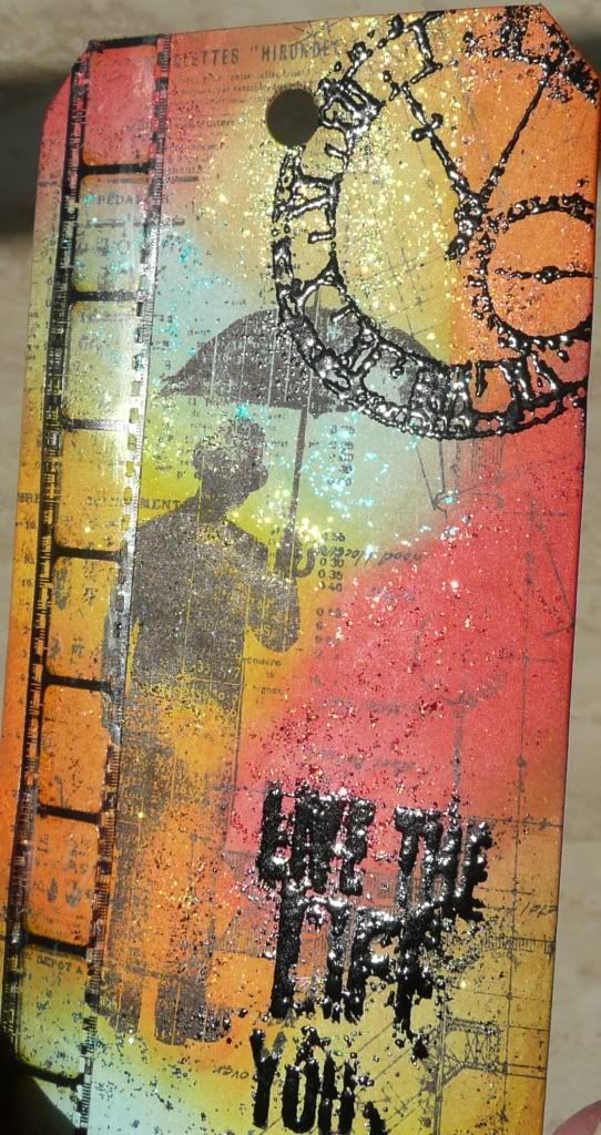
But this one does. :)
I coloured this tag with Distress Inks and then rubbed a thin layer of various colours of Stickles over the top and left to dry. I then edged with Tea Dye ink and stamped some TH steampunk images to form a background. I then stamped the umbrella man, the clock face and the wording and heat embossed the last two with black embossing powder. To finish I added a length of TH film strip.

I love how this turned out. It's at once vintagey and distressedy but glittery and vibrant. :)

Sunday, 14 August 2011

Shabby Chic Frame

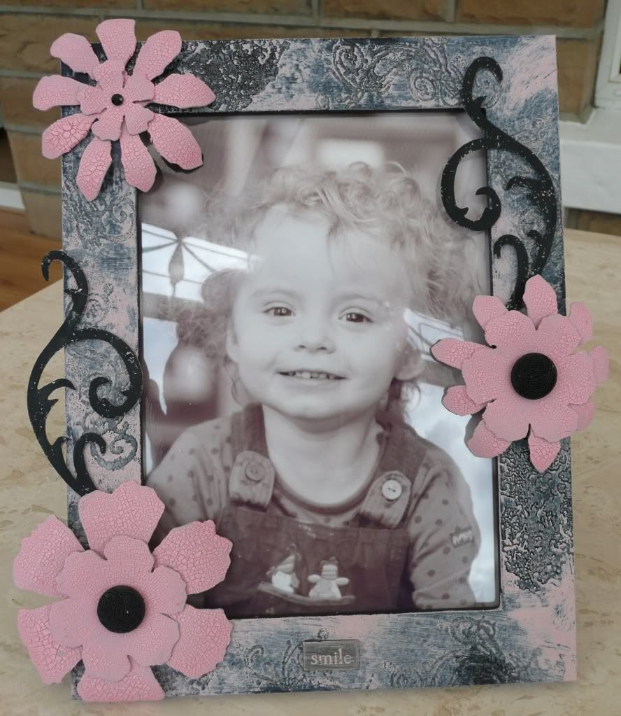
This is my project for the Simon Says Stamp and Show challenge this week. The challenge was to use a Tim Holtz technique so I had a browse through Lord T of H's munificent Compendium of Curiosities and settled on the Shabby Chic technique and made this:


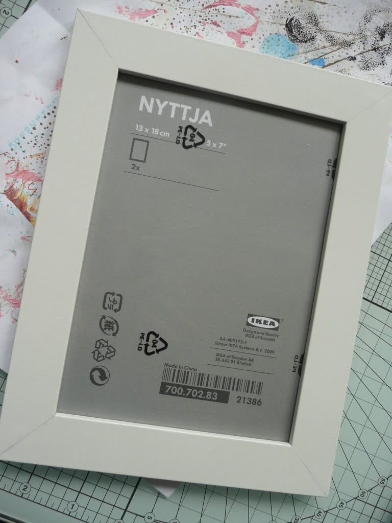
This started off as a plain and simple (and very cheap!) frame from Ikea:


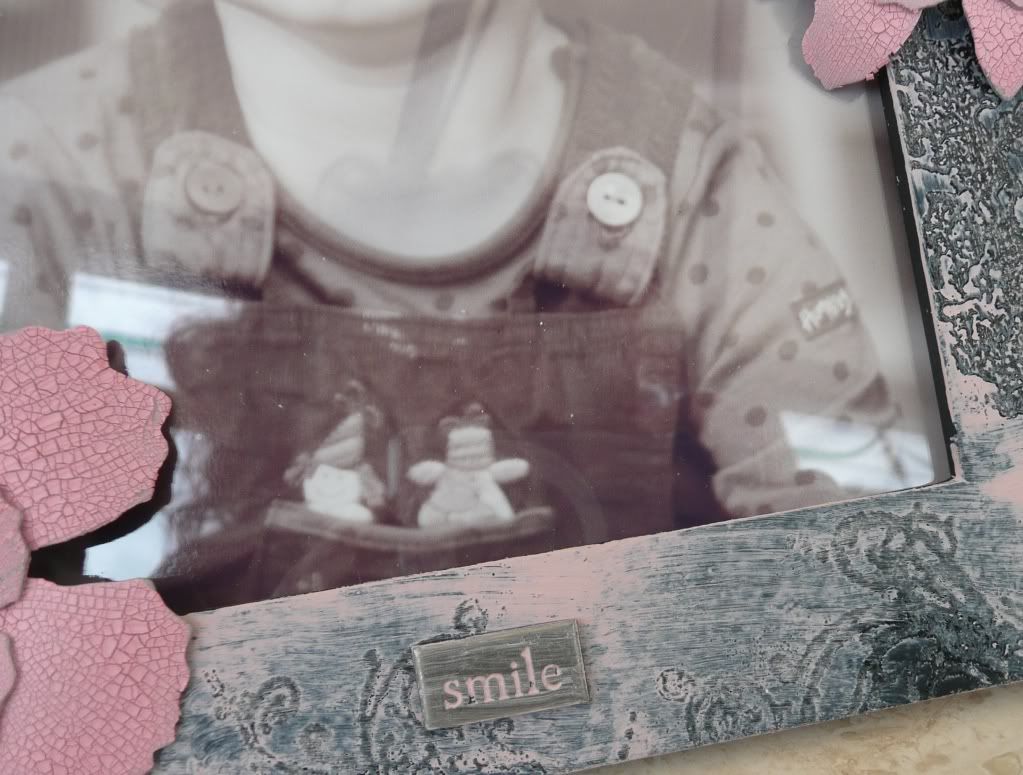
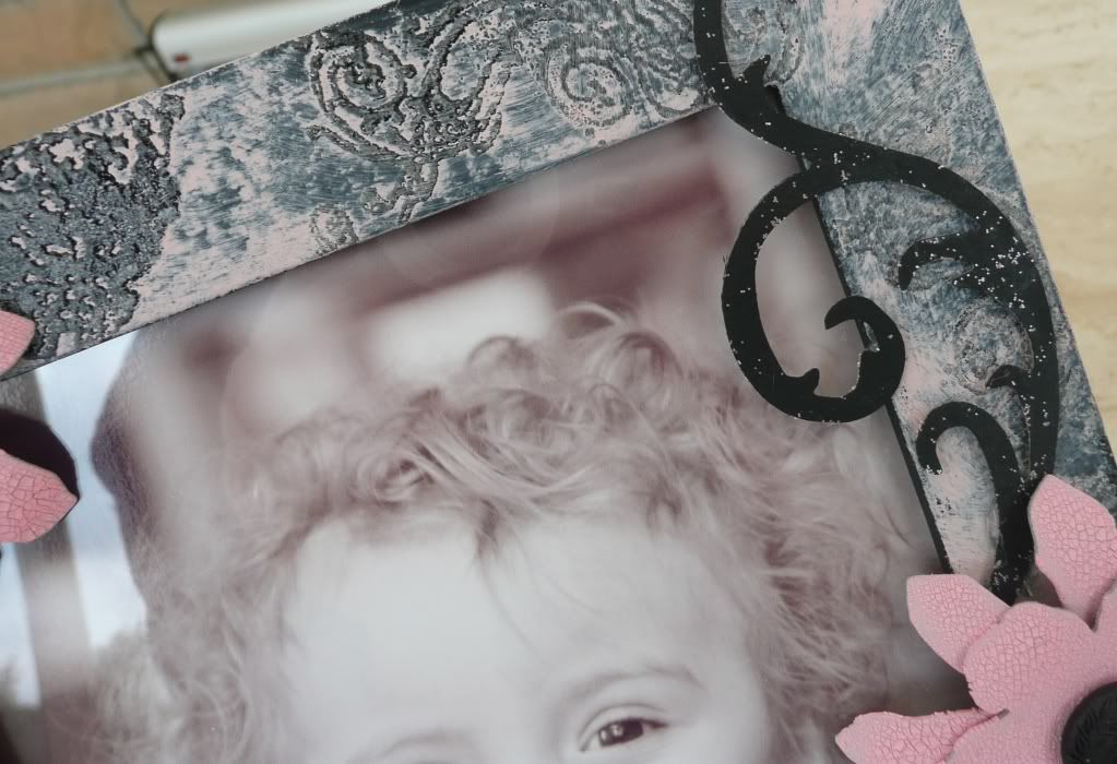
The first step was to paint it... and that took some doing as, once I unwrapped the cellophane from my 2-pack of frames, I found that they were made with a kind of plasticy-coated, glossy material that not even Gesso would stick to! So I hand to give the whole thing a quick sanding to key the surface enough for paint to stick to and then I gave it a coat of Gesso and then used Black Adirondack paint dabber all over it. Once the paint was dry I stamped flower and flourish designs (both TH stamps) here and there using Distress Embossing Ink and heat embossed with clear embossing powder. The next step was to add a layer of pink paint all over (again using Adirondack paint dabber) and, using a piece of damp kitchen roll, wipe off the paint over the embossed areas, leaving a nice shabby chic colour wash over the entire frame.

I then die-cut Tattered Florals and Elegant Flourishes from grungepaper. I painted the flowers with pink Crackle Paint and painted the flourishes with the black paint dabber and, once dry, rubbed a little Cotton Candy Stickles over them. These were glued onto the frame, using a hot glue gun, and buttons (from my "random bits and bobs" tub) and gemstones added to the centres of the flowers. I also painted pink Paint Dabber over a little Making Memories metal word accent and wiped the excess paint away, leaving the debossed wording filled with paint, and attached to the bottom of the frame. Et voila.

I couldn't think of a more appropriate picture to put in this pretty frame than one of my very pretty (IMO) DD1. :)

Sunday, 7 August 2011

Butterfly Tag

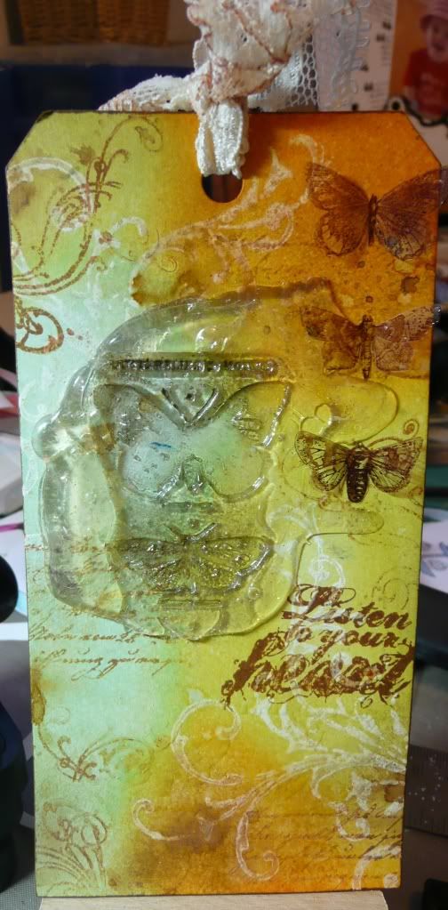
This is a tag I created for this week's challenge over at Simon Says Stamp and Show:


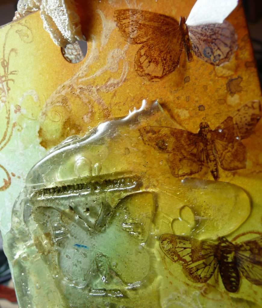
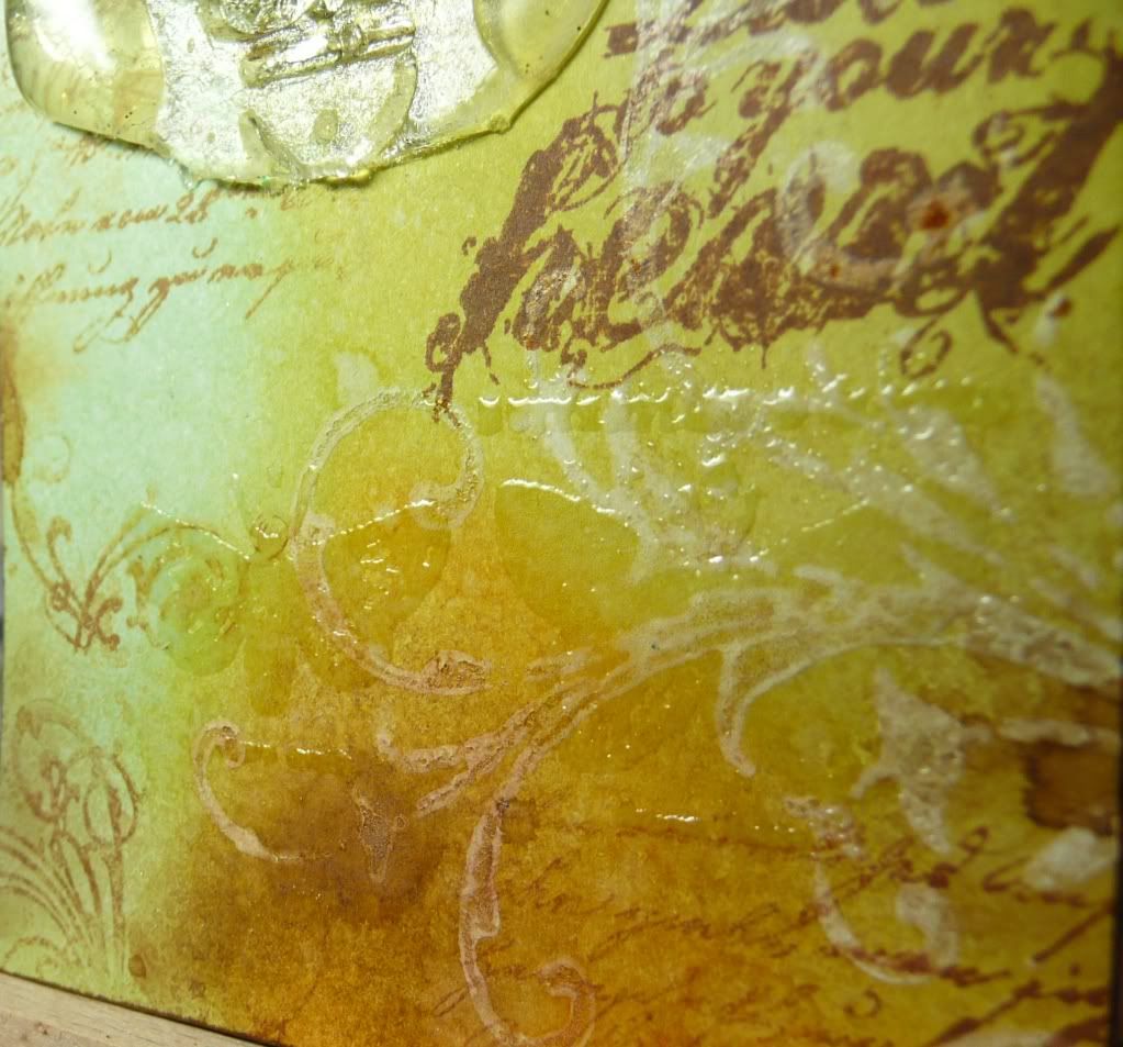
I had lots of fun with this getting inky and messy and playing with lots of different techniques. I stamped a couple of swirls (using a Crafty Individuals stamp) in white Adirondack Paint Dabber and then inked the background with Distress Inks, wiping the ink off the paint swirls to let them show through. I then stamped a few background images in Sepia Archival ink (using Tim Holtz stamps) and spritzed with lemon juice and heated for a funky aged effect (as used in the latest issue of Craft Stamper magazine). I then had a play with some UTEE, stamping into melted UTEE to make a chunky embellishment (also a technique featured recently in Craft Stamper magazine):


I then stamped some butterflies across the bottom of the tag and embossed them with clear embossing powder (a bit hard to see in the main photo):


I stamped the wording in Sepia Archival Ink and then stamped more butterflies in brown StazOn onto acetate, cut them out and folded up the wings and attached with Glossy Accents. To finish off I edged the whole tag with Sepia Archival ink and added a scrap of cream lace which I'd inked a little with Tea Dye Distress Ink.

Related Posts Plugin for WordPress, Blogger...